UConn DMD Site Redesign
Overview
During my senior year at the University of Connecticut (UConn), I was tasked with redesigning the Digital Media & Design Department’s (DMD) website, hosted on WordPress, along with a few classmates in my major. We were responsible for taking the website from ideation stage to a launched, final product. My classmates and I had an entire semester to collaborate on this project, and while where we were able to exercise our UX knowledge, we learned more along the way.
Time
Jan 2018 - May 2018
Problem
The original DMD website had been carelessly thrown together about a year prior to our redesign. There was no clear design system, the color scheme used the six main colors of the rainbow, and not much thought had gone into the layout or purpose of the overall site. WordPress does come with its own limitations, on top of the university’s restrictions when it comes to their branding, but it didn’t excuse the issue at hand: the website was poorly constructed.
Site Map
After documenting every page that existed on the original site, we established the relationships between each page and agreed on top level items and subsequent sections that reflected those connections.
Design Goal
There was an attempt to make the site seem creative with the rainbow theme, but overall, the site was dark and wasn’t very modern. The site also lacked a sense of excitement, which could be detrimental to receiving applications from prospective students. Sadly, nothing about it made me think, “I would love to be a part of this department.” In turn, the design goals were simple. The first was to rebrand UConn DMD and introduce some enthusiasm into our new design system, making it a top choice for applying students. Second, it was important for us to make the site easy to use. The new layout had to be straightforward and easily navigable.
User Personas
The two user personas we created in order to characterize those that might use DMD’s new site were prospective students and current students.
User Stories
As a prospective student, I can look at the degrees I can graduate with.
As a prospective student, I can view and learn more all of the concentrations the department has to offer.
As a prospective student, I can look at the work produced by students and faculty.
As a prospective student, I can get a perspective of both the Storrs campus and Stamford campus.
As a prospective student, I can get more information about the department and staff.
As a prospective student, I can read about and go through the application process.
As a current student, I can explore DMD internship opportunities.
As a current and prospective student, I can look at the resources available to me through the department.
Design System
Keeping UConn’s brand colors in mind as part of the requirement, their primary color, navy blue, was chosen to be used in the header container and search bar. The remaining two colors, a sky blue and a true yellow, were picked to represent the department. Blue is described to be seen as trustworthy, dependable, and inspires feelings of loyalty. Yellow brings in optimism and conveys fresh energy and opportunity. These were adjectives we believed DMD to be. The font Helvetica Neue was chosen across all headers and text – also a UConn requirement.
Wireframes
Once the pieces were put together, my classmates and I divided the wireframes equally and got to work.
Incorporating the Changes
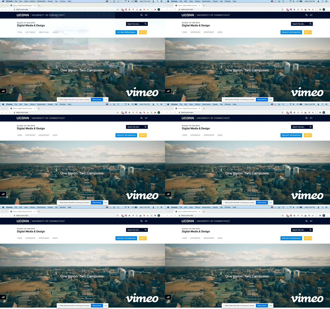
Below is a video of the current DMD website.
Conclusion
The website was approved and officially launched after I graduated, just in time for the returning and new Fall students, as well as high school juniors and seniors who were seeking a department that could fulfill all of their media needs.
